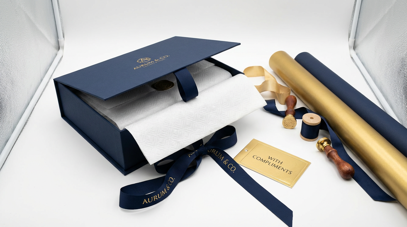
A regional bank's rebranding initiative in 2023 extended beyond their visual identity refresh—it fundamentally changed how they approached corporate gifting. Their shift from traditional gold accents to a sophisticated navy-and-copper palette wasn't arbitrary; it reflected a calculated repositioning from "established wealth manager" to "innovative financial partner." The gift boxes distributed to their top 500 clients carried this message through every design element, from the matte navy exterior to the copper foil stamping on the interior lid.
The response validated their strategy. Client surveys revealed 68% associated the new color scheme with "forward-thinking" and "trustworthy"—precisely the dual positioning they sought. This case illustrates a principle many procurement teams overlook: color choices in corporate gifts function as non-verbal brand communication, carrying psychological weight that either reinforces or contradicts your intended message.
The Neuroscience Behind Color Perception
Color processing occurs in the brain's visual cortex before conscious thought, making it one of the fastest-forming impressions in human cognition. Research from the Institute of Neuroscience and Psychology at the University of Glasgow demonstrates that color associations form within 90 milliseconds of viewing an object—significantly faster than processing text or recognizing shapes.
For corporate gifts, this neurological reality means your color selection communicates before recipients consciously evaluate the gift's quality or utility. A technology startup distributing charcoal-gray gift sets signals different values than one choosing vibrant coral packaging, regardless of identical contents.
Cultural context layers additional complexity onto these biological responses. In Singapore's multicultural business environment, color symbolism varies across Chinese, Malay, Indian, and Western business traditions. Red carries auspicious connotations in Chinese culture but may signal caution in Western contexts. Understanding these nuances becomes critical when your recipient base spans multiple cultural backgrounds.
Industry-Specific Color Strategies
Financial Services and Professional Services
Navy blue dominates this sector for neurological reasons beyond convention. Studies published in the Journal of Business Research show navy activates brain regions associated with stability and competence judgments. When packaging design incorporates navy as the primary color, recipients subconsciously attribute these qualities to the gifting organization.
One wealth management firm conducted A/B testing with their year-end client gifts: identical leather portfolios in navy versus burgundy packaging. Post-gift surveys revealed navy recipients rated the firm 23% higher on "financial stability" measures, despite no change in actual service quality. The color alone shifted perception.
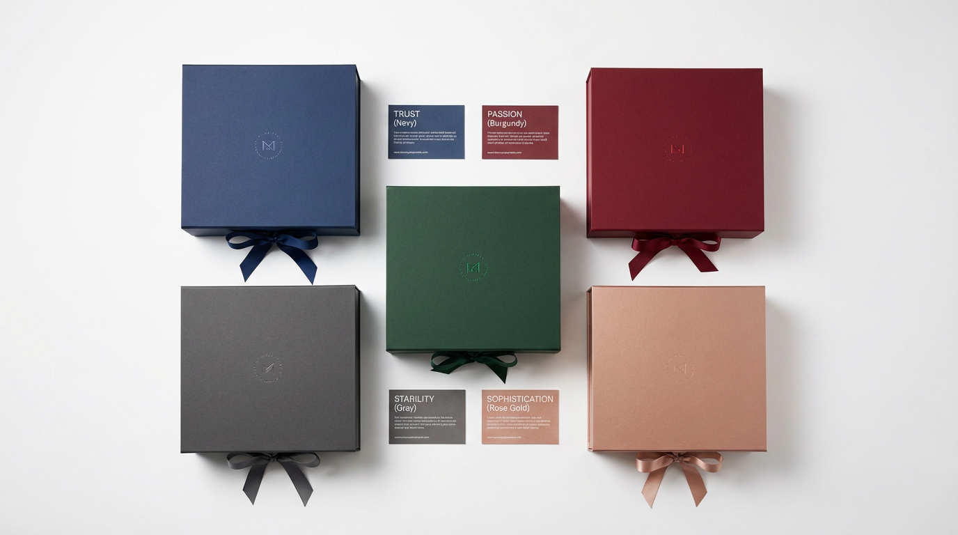
Charcoal gray serves similar psychological functions while projecting modernity over tradition. Singapore's fintech sector gravitates toward gray-dominant gift designs, distinguishing themselves from traditional banks while maintaining professional credibility. The key lies in pairing—gray with copper or rose gold accents signals innovation, while gray with silver leans conservative.
Technology and Innovation Sectors
The technology sector's color psychology operates differently. Where financial services prioritize trust signals, tech companies emphasize creativity and forward-thinking. This explains the prevalence of unexpected color combinations: teal with orange, purple with lime, coral with navy.
However, execution matters enormously. A poorly executed "creative" color scheme reads as unprofessional rather than innovative. The distinction lies in color theory fundamentals: complementary colors (opposite on the color wheel) create visual tension that signals energy, while analogous colors (adjacent on the wheel) suggest harmony and sophistication.
One semiconductor manufacturer learned this through trial. Their initial gift design paired bright orange with electric blue—complementary colors that should work theoretically. Client feedback described the combination as "jarring" and "cheap-looking." Adjusting to burnt orange with navy (muted versions of the same complementary pair) achieved the innovative positioning without the negative associations. The lesson: color theory provides the framework, but saturation and tone determine success.
Healthcare and Wellness Industries
Healthcare organizations face unique color psychology challenges. They must signal both clinical competence and human compassion—qualities that pull toward different color families. The solution most Singapore healthcare providers adopt: dual-color strategies.
Primary colors (typically navy or forest green) establish credibility, while accent colors (soft coral, warm gold, or sage green) introduce approachability. A private hospital's physician appreciation gifts exemplified this: forest green leather notebooks with rose gold foil stamping. The green signaled medical expertise and natural wellness, while rose gold added warmth and personal value.
Research from the Singapore Health Services supports this approach. Patient satisfaction surveys correlate positively with healthcare environments incorporating both "trust colors" (blues and greens) and "comfort colors" (warm neutrals and soft pastels). Corporate gifts extending this color psychology reinforce the brand associations patients already hold.
Cultural Considerations in Singapore's Market
Singapore's multicultural business landscape requires color strategies that respect diverse symbolic systems while maintaining brand consistency. This doesn't mean avoiding all culturally significant colors—it means understanding their contexts and deploying them strategically.
Red presents the most complex case. In Chinese business culture, red symbolizes prosperity and good fortune, making it appropriate for Lunar New Year corporate gifts. However, the same red in Western business contexts may signal urgency or warning. The solution lies in application: red as an accent color (ribbon, interior lining, foil stamping) carries positive associations across cultures, while red as the dominant exterior color requires careful audience consideration.
Gold faces similar complexity. In Chinese and Indian cultures, gold represents wealth and auspiciousness. In Western minimalist design trends, gold can read as ostentatious. The key differentiator: tone and finish. Muted gold or rose gold maintains luxury associations while feeling contemporary, whereas bright yellow-gold skews traditional.
One multinational corporation operating in Singapore developed a color decision matrix for their gifting programs: Chinese New Year gifts incorporated red and gold prominently, Deepavali gifts featured gold with deep purple or burgundy, while year-end corporate gifts used navy with copper accents—culturally neutral while maintaining luxury positioning.
Practical Implementation Guidelines
Color Consistency Across Touchpoints
Your corporate gift color scheme should align with existing brand touchpoints. If your website, business cards, and office interiors emphasize cool grays and blues, introducing warm terracotta in gift packaging creates cognitive dissonance. Recipients subconsciously question whether the gift truly represents your organization.
However, alignment doesn't require exact matching. A technology company whose primary brand color is bright blue can use navy or slate blue in gift packaging—the color family remains consistent while the muted tone signals sophistication appropriate for premium gifts.
Testing and Validation
Before committing to large gift orders, test color selections with a representative sample of your target audience. This doesn't require formal focus groups—showing mockups to 10-15 clients or employees from your target demographic provides valuable directional feedback.
Pay attention to unexpected associations. One professional services firm discovered their chosen sage green, intended to signal growth and renewal, reminded recipients of hospital scrubs—exactly the opposite of their luxury positioning. A small testing investment prevented a significant brand messaging failure.
Seasonal and Occasion Adaptations
Color psychology shifts with context. Deep burgundy and forest green work beautifully for year-end corporate gifts, leveraging festive associations without being explicitly Christmas-themed. The same colors feel out of place for mid-year appreciation gifts, where lighter tones (soft blues, warm grays, blush tones) better match the season.
Singapore's tropical climate influences these seasonal considerations differently than temperate markets. Heavy, dark colors (deep burgundy, chocolate brown, forest green) can feel oppressive in our year-round heat. Successful local gifting strategies often incorporate lighter versions of traditional corporate colors: slate blue instead of navy, warm taupe instead of chocolate brown, sage instead of forest green.
Measuring Color Strategy Effectiveness
Quantifying color psychology's impact requires indirect measurement—recipients rarely consciously attribute their impressions to color choices. However, several metrics provide useful signals:
Brand Attribute Surveys: Include questions about brand perception (innovative vs. traditional, approachable vs. formal, creative vs. conservative) in post-gift recipient surveys. Compare responses across different color schemes to identify patterns.
Gift Retention and Display: Gifts recipients keep visible in their offices or homes signal positive associations. One consulting firm tracked this by noting which gift items appeared in client video call backgrounds—their navy leather desk accessories appeared in 34% of client calls, while a previous year's bright orange items appeared in only 8%.
Referral and Recommendation Rates: While multiple factors influence referrals, tracking recommendation rates following gift campaigns with different color schemes can reveal preference patterns. One B2B software company found their charcoal-and-copper gift campaign generated 28% more qualified referrals than their previous bright-blue campaign, despite identical gift utility.
Common Color Psychology Mistakes
Trend-Chasing Over Brand Alignment
Pantone's Color of the Year generates significant buzz, but incorporating trendy colors that contradict your brand identity creates confusion. A law firm adopting "Viva Magenta" because it's fashionable undermines their positioning far more than it demonstrates contemporary awareness.
Ignoring Material Interactions
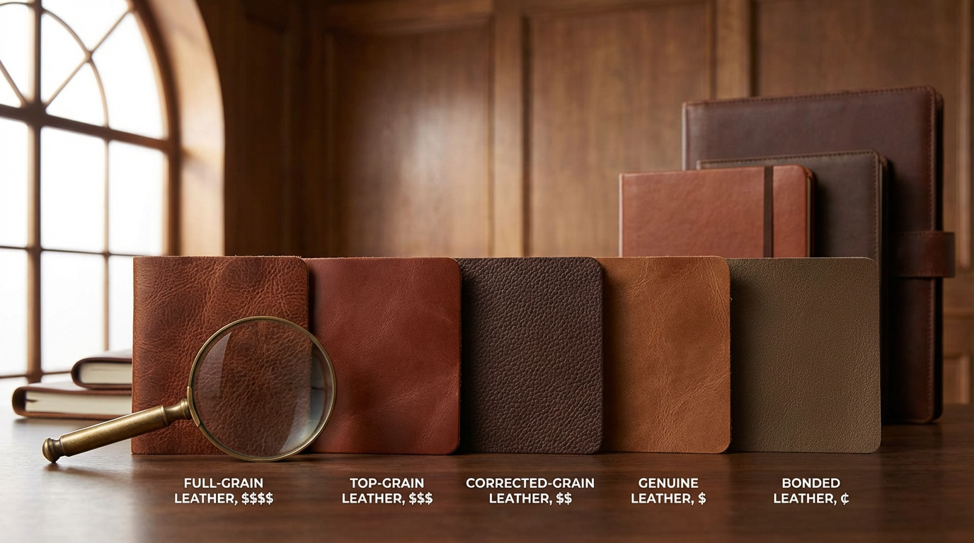
Colors appear different across materials. Navy leather reads sophisticated; navy plastic reads cheap. Copper foil stamping signals luxury; copper screen printing can look garish. Test your color selections on actual materials, not just digital mockups.
Overcomplicating Color Palettes
Corporate gifts work best with 2-3 colors maximum: a primary color (typically covering 60-70% of the design), a secondary color (20-30%), and optionally an accent color (10%). More colors dilute brand messaging and often appear chaotic rather than creative.
Strategic Color Selection Framework
When selecting colors for corporate gift programs, work through this decision sequence:
- Identify Core Brand Attributes: List 3-5 qualities your organization wants recipients to associate with your brand (trustworthy, innovative, approachable, sophisticated, etc.)
- Map Colors to Attributes: Research which colors psychologically align with your target attributes. Cross-reference with cultural considerations for your recipient base.
- Audit Existing Brand Colors: Determine if current brand colors already support your desired attributes, or if gift packaging offers an opportunity to introduce supporting colors.
- Consider Context and Occasion: Adjust color intensity and tone based on season, occasion, and recipient relationship (new client vs. long-term partner).
- Test and Validate: Show mockups to representative recipients before finalizing large orders.
- Measure and Iterate: Track recipient responses and adjust future gift color strategies based on data.
Color psychology in corporate gifting isn't about following rigid rules—it's about understanding how visual elements communicate brand values and strategically deploying that knowledge. The most effective corporate gift programs treat color selection as seriously as they treat quality control and budget management, recognizing that psychological impact drives long-term brand perception.
For organizations seeking to align their corporate gift strategy with broader brand positioning, our team provides color psychology consultation as part of our design services. Contact us to discuss how color selection can reinforce your brand messaging.
Related Articles

How Packaging Design Influences Corporate Gift Perceived Value: Beyond the Product Inside
How Packaging Design Influences Corporate Gift Perceived Value: Beyond the Product Inside

Leather Grades for Corporate Gifts: Why Top-Grain Costs 3× More Than Genuine Leather
Leather Grades for Corporate Gifts: Why Top-Grain Costs 3× More Than Genuine Leather

Why Your Approved Sample Doesn't Match Production: Understanding Manufacturing Variance in Corporate Gifts
Why Your Approved Sample Doesn't Match Production: Understanding Manufacturing Variance in Corporate Gifts