The Color Specialist's Imperative: Mastering Pantone Matching Across the Material Matrix
In the high-stakes world of B2B branding, color is not merely an aesthetic choice; it is a non-negotiable asset. A brand's signature hue, whether it's a corporate blue or a vibrant accent, carries the weight of identity, trust, and recognition. The Pantone Matching System (PMS) provides the essential universal language for this communication. However, the journey from a specified Pantone chip to a finished product—especially when that product spans multiple, disparate materials like metal, fabric, and plastic—is fraught with technical challenges. For the color specialist, this process is less about art and more about applied science, demanding a rigorous understanding of material science, spectrophotometry, and standardized viewing conditions. The goal is not just a close match, but a perceptually identical match, a standard increasingly defined by the stringent tolerance of Delta E (ΔE) < 2.0.
The Material Matrix: Color Shift Challenges
The core difficulty in cross-material color matching lies in the phenomenon of substrate interaction and the inherent optical properties of the materials themselves. A single Pantone reference color, when applied to different substrates, will inevitably exhibit a color shift due to variations in texture, porosity, and light interaction.
Metal: The Challenge of Specularity and Finish
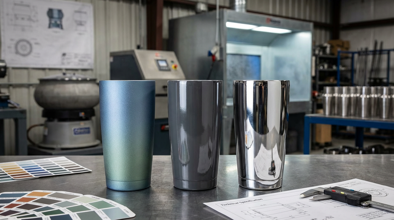
Metal, often used for premium corporate gifts like engraved pens or power banks, presents a unique challenge due to its specularity (glossiness) and non-porous surface. The color is typically applied via anodization, powder coating, or specialized printing.
- Specularity: Highly polished metal surfaces reflect light directionally, which can make the color appear lighter or darker depending on the viewing angle. This is a primary cause of perceived color shift.
- Substrate Color: The base metal (e.g., silver aluminum) can influence the final color, especially with translucent coatings like anodization. The color specialist must account for this base color in the formulation.
Fabric: The Challenge of Texture and Absorption
Fabric, common in apparel, bags, and lanyards, is defined by its porosity and texture. The way light scatters across woven fibers is fundamentally different from how it reflects off a smooth surface.
- Light Trapping: The weave structure of fabric traps light, which can make the color appear less saturated or darker than the smooth, printed paper of a Pantone guide.
- Dye Absorption: Dyes are absorbed into the fibers, and the chemical composition of the fiber (e.g., cotton vs. polyester) dictates how the color pigment is rendered. A color that is easily achieved on polyester may be impossible on cotton, necessitating a shift from the PMS system to the Pantone Fashion, Home + Interiors (FHI) system for textiles [1].
Plastic: The Challenge of Opacity and Additives
Plastic, ubiquitous in molded products, introduces variables related to opacity and chemical composition.
- Opacity: The color specialist must decide between a translucent, opaque, or transparent color. Achieving an opaque color requires high concentrations of white or black pigments, which can alter the hue and saturation of the primary color.
- Thermal Stability: The colorants used in plastic must withstand the high temperatures of injection molding without degrading or shifting color, a critical consideration that is absent in print-based matching.
The Science of Consistency: Delta E and Premium Tolerance
To move beyond subjective visual assessment, the industry relies on colorimetry and the Delta E (ΔE) metric. Delta E, literally "Difference in Energy," is the universal standard for quantifying the difference between two colors—the target Pantone color and the produced sample.
The Evolution to ΔE 2000
Older ΔE formulas (like ΔE 76) were mathematically simple but perceptually flawed, often assigning a high ΔE value to a color difference that the human eye could barely detect, and vice versa. The modern standard for professional work is CIE ΔE 2000 [2]. This formula is significantly more complex because it incorporates weighting factors that account for the non-uniformity of human color perception, particularly in the blue and gray regions.
| Delta E (ΔE 2000) Value | Perceptual Meaning | Application Standard |
| :--- | :--- | :--- |
| < 1.0 | No perceptible difference to the average human eye. | Museum-grade reproduction, primary brand assets. |
| < 2.0 | Difference is perceptible, but acceptable for high-quality commercial work. | Premium B2B corporate gifts, high-end packaging. |
| 2.0 - 3.0 | Difference is clearly visible; acceptable for general commercial printing. | Standard promotional merchandise. |
| > 3.0 | Unacceptable color mismatch; requires correction. | Failure to meet brand standards. |
The ΔE < 2.0 Imperative
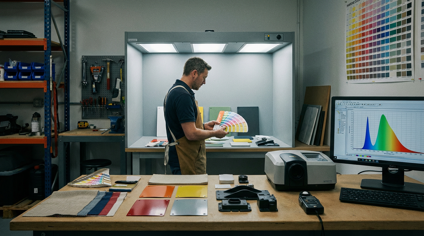
For premium B2B work, such as high-value corporate gifts, the standard of ΔE < 2.0 is mandatory. This tight tolerance ensures that a client's brand color remains consistent across a metal tumbler, a fabric tote bag, and a plastic USB drive. A color specialist's role is to use a spectrophotometer to measure the sample's color values (Lab*) and calculate the ΔE 2000 against the target, providing an objective, quantifiable pass/fail metric.
The Light Factor: D65 vs. D50 and Metamerism
Color is light, and the perceived color of an object is entirely dependent on the light source under which it is viewed. This makes standardized lighting conditions a cornerstone of the professional color matching protocol.
Standard Illuminants
The two most critical standard illuminants in B2B manufacturing are D65 and D50:
- D65 (Daylight 6500K): Simulates average North Sky Daylight with a color temperature of 6500 Kelvin. This is the global standard for general color evaluation, particularly for industrial and textile applications.
- D50 (Daylight 5000K): Simulates a warmer, midday daylight with a color temperature of 5000 Kelvin. This is the mandatory standard for the graphic arts, printing, and pre-press industries [3].
A color specialist must ensure that the final product is evaluated under the correct light source for its intended use. For corporate gifts, which are often viewed in a variety of environments, evaluation under both D65 and D50 is often required to check for metamerism.
Metamerism: The Hidden Threat
Metamerism is the phenomenon where two colors appear to match under one light source (e.g., D50) but fail to match under another (e.g., D65). This occurs because the two colorants have different spectral reflectance curves. A metameric match is a catastrophic failure in cross-material branding, as a client's logo could look perfect in the factory but completely wrong in their office. The professional protocol demands that all samples pass the ΔE < 2.0 tolerance under at least two different standard illuminants to mitigate the risk of metamerism.
The Professional Matching Protocol: A Step-by-Step Workflow
Achieving cross-material color consistency is a systematic, multi-step process that requires collaboration between the brand, the color specialist, and the manufacturer.
Step 1: Target Definition and Material Assessment
The process begins with the client providing the target Pantone number. The color specialist then conducts a Material Feasibility Assessment, determining if the color is chemically achievable on the specified substrates (metal, fabric, plastic). If the color is impossible or highly unstable on a material, the specialist must propose the closest, most stable alternative and secure client approval before production begins.
Step 2: Digital Formulation and Recipe Creation
Using advanced Color Formulation Software (e.g., X-Rite tools), the specialist translates the target Lab* values into a precise colorant recipe for each material. This recipe is unique for each substrate:
- Fabric: A specific dye mixture and concentration.
- Plastic: A specific pigment and additive masterbatch.
- Metal: A specific powder coating or anodization bath mixture.
Step 3: Trial Production and Sample Generation
Small-scale trial runs are executed for each material. The manufacturer produces a physical sample (a "lab dip" for fabric, a "drawdown" for metal, or a "chip" for plastic) using the specialist's recipe.
Step 4: Spectrophotometric Measurement and Correction
This is the critical quality control step. The specialist uses a spectrophotometer to measure the sample's Lab* values and calculates the ΔE 2000 against the target.
- If ΔE < 2.0, the sample is approved, and the recipe is locked for mass production.
- If ΔE > 2.0, the specialist analyzes the Lab* deviation (e.g., too red, too light) and adjusts the digital formulation (Step 2) to create a new, corrected recipe. This iterative process continues until the tolerance is met.
Step 5: Final Verification and Documentation
The final approved samples are retained as physical standards. The specialist generates a Color Quality Report detailing the final Lab* values, the ΔE 2000 under D65 and D50, and the approved production recipe. This documentation ensures that all future production runs, regardless of location or time, can be held to the exact same standard.
Conclusion: The B2B Value of Color Precision
In the competitive landscape of corporate merchandise and B2B branding, color consistency is the ultimate differentiator. When a client invests in a suite of branded products—from high-end metal awards to custom-dyed apparel—they are purchasing the promise of a unified brand experience. A failure in color matching, even a visually subtle one, erodes brand integrity and signals a lack of quality control.
By adhering to a rigorous protocol that masters the material matrix, leverages the precision of the ΔE 2000 standard, and controls for the light factor, the color specialist transforms a complex manufacturing challenge into a reliable, repeatable process. This commitment to color precision is not an overhead cost; it is a fundamental investment in the client's brand equity and a testament to the quality of the final corporate gift [4].
Internal Links
References
[1] Pantone. WE HAVE TWO COLOUR SYSTEMS – THE PANTONE MATCHING SYSTEM (PMS), AND THE PANTONE FASHION, HOME + INTERIORS (FHI) SYSTEM. [Online]. Available: https://pantone.net.au/pages/pantone-color-systems-intro
[2] Skychemi. Color Difference Formula and ΔE: CIE Standards and Color. [Online]. Available: https://skychemi.com/color-difference-formula-delta-e/
[3] Waveform Lighting. What is D50 for graphic arts & printing?. [Online]. Available: https://www.waveformlighting.com/color-matching/what-is-d50-for-graphic-arts-printing
[4] Apex Gifts and Prints. Mastering B2B Corporate Gifting: A Comprehensive Guide. [Online]. Available: https://apexgiftsandprints.com/blogs/news/mastering-b2b-corporate-gifting-a-comprehensive-guide
[5] Imprint Engine. The Ultimate Guide to Branded Corporate Gifts. [Online]. Available: https://imprintengine.com/blog/branded-corporate-gifts-guide/
[6] Cristaux. Corporate Gifts with Branding: Benefits, Ideas, Best Practices. [Online]. Available: https://www.cristaux.com/blog/corporate-gifts-with-branding/
Related Articles

Laser Engraving vs Embossing for Premium Leather Goods
Laser Engraving vs Embossing for Premium Leather Goods

Multi-Color Pad Printing Registration Accuracy
Multi-Color Pad Printing Registration Accuracy

Metal Surface Finishing for Corporate Gifts: Anodizing vs Powder Coating vs Electroplating Performance Data
Metal Surface Finishing for Corporate Gifts: Anodizing vs Powder Coating vs Electroplating Performance Data